Cranes
Observations de grues en Suède
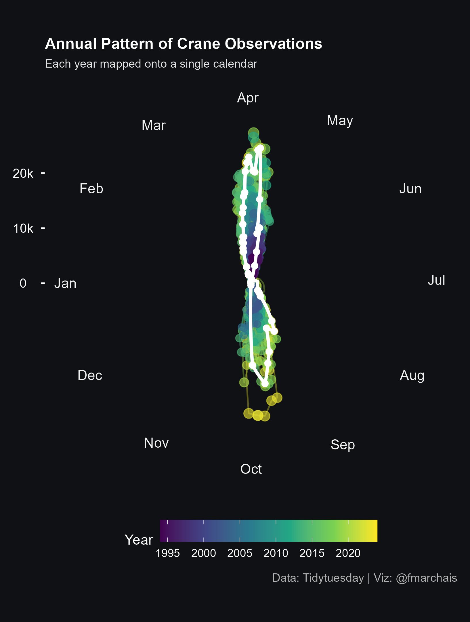
Cette semaine, le jeu de données porte sur l’observation de grues (les oiseaux) au lac Hornborgasjön, en Suède, entre 1994 et 2025.
L’objectif de ma visualisation est de mettre en évidence la saisonnalité des observations ainsi que leur augmentation au fil des ans. L’année la plus récente (2025) est indiquée en blanc.
Le code pour obtenir ce graphe :
##### SETUP ######
library(tidytuesdayR)
library(lubridate)
library(ggplot2)
library(dplyr)
library(scales)
library(grid)

# For months names
Sys.setlocale("LC_TIME", "English")


##### DATA #####
tuesdata <- tidytuesdayR::tt_load('2025-09-30')
cranes <- tuesdata$cranes


##### CLEANING ######
clean_cranes <- cranes %>%
  mutate(
    year = year(date),
    date = as.Date(sprintf("2025-%02d-%02d", month(date), day(date))),
    month_day = format(date, "%b-%d")
  ) %>%
  filter(!is.na(date) & !is.na(observations))

# determine the most recent year to highlight it
latest_year <- max(clean_cranes$year, na.rm = TRUE)

# Get the "next" 10.000 after maximal observation number
y_limit <- ((max(clean_cranes$observations, na.rm = TRUE) %/% 10000) + 1) * 10000


#####PLOT #####
clean_cranes %>%
  ggplot(aes(x = date, y = observations, group = factor(year), color = year)) +

  # light, semi-transparent lines per year
  geom_line(alpha = 0.35, linewidth = 0.6) +

  # points sized by observation count (smaller range so they don't dominate)
  geom_point(aes(size = observations), alpha = 0.6, show.legend = FALSE) +
  scale_size(range = c(0.8, 3.5)) +

  # highlight the most recent year with a bold, bright line and points on top
  geom_line(
    data = filter(clean_cranes, year == latest_year),
    aes(x = date, y = observations, group = factor(year)),
    color = "#FFFFFF",
    size = 1.2,
    inherit.aes = FALSE
  ) +
  geom_point(
    data = filter(clean_cranes, year == latest_year),
    aes(x = date, y = observations),
    color = "#FFFFFF",
    size = 2,
    inherit.aes = FALSE
  ) +

  # continuous color gradient for the year variable using the viridis-like ramp
   scale_color_viridis_c(guide = guide_colorbar(title = "Year", barwidth = unit(6, "cm"))) +

  # radial (y) axis - keep the scale available for plotting but don't show the default radial text
  scale_y_continuous(
    limits = c(0, y_limit),
    expand = c(0, 0),
    breaks = c(0,10000,20000),
    labels = c("0","10k","20k")
  ) +

  # show months around the circle
  scale_x_date(
    breaks = seq(as.Date("2025-01-01"), as.Date("2025-12-01"), by = "1 month"),
    labels = function(x) format(x, "%b"),
    limits = c(as.Date("2025-01-01"), as.Date("2025-12-31"))
  ) +

  # polar coordinates with January at top
  coord_polar(start = -pi/2) +

  # labels
  labs(
    title = "Annual Pattern of Crane Observations",
    subtitle = "Each year mapped onto a single calendar",
    caption = "Data: Tidytuesday | Viz: @fmarchais",
    x = NULL,
    y = NULL
  ) +

  # revert the earlier radial-label tweak (remove visible radial labels in the margin)
  theme(
    panel.background = element_rect(fill = "#0f1115", colour = NA),
    plot.background = element_rect(fill = "#0f1115", colour = NA),
    legend.background = element_rect(fill = "#0f1115", colour = NA),
    legend.key = element_rect(fill = NA, colour = NA),
    text = element_text(color = "white"),
    plot.title = element_text(size = 12, face = "bold", color = "white"),
    plot.subtitle = element_text(size = 9, color = "grey90"),
    plot.caption = element_text(size = 9, color = "grey70"),

    # make y & x axis more visible
    axis.text.y = element_text(color = "white", size = 10, margin = margin(r = 6), hjust = 0.5),
    axis.ticks.y = element_line(color = "white", size = 0.5),
    axis.ticks.length = unit(3, "pt"),
    axis.text.x = element_text(color = "grey95", size = 11),

    # remove the "net" in the background (radial grid)
    panel.grid.major.y = element_blank(),
    panel.grid.major.x = element_blank(),
    panel.grid.minor = element_blank(),
    axis.title = element_blank(),
    plot.margin = margin(10, 10, 10, 10),

    legend.position = "bottom"
  )


# ggsave(filename = "my_plot.png", dpi = "retina")